
When you repeat something, as we learned yesterday, you create a pattern. However, certain types of repetition can also create the perception of “shapes”, and that affects where the user’s eyes will go. So today we will learn about:
Line Tension and Edge Tension
(If you’re just starting the UX Crash Course, Start Here.)
Are you tired of the ducks yet? No, I didn’t think so.
Visual “tension” is a concept that seems very elementary, but you’d be amazed how useful it can be. Our brains are a little too good at seeing patterns where they don’t exist. As a designer you can use that.
Line Tension:
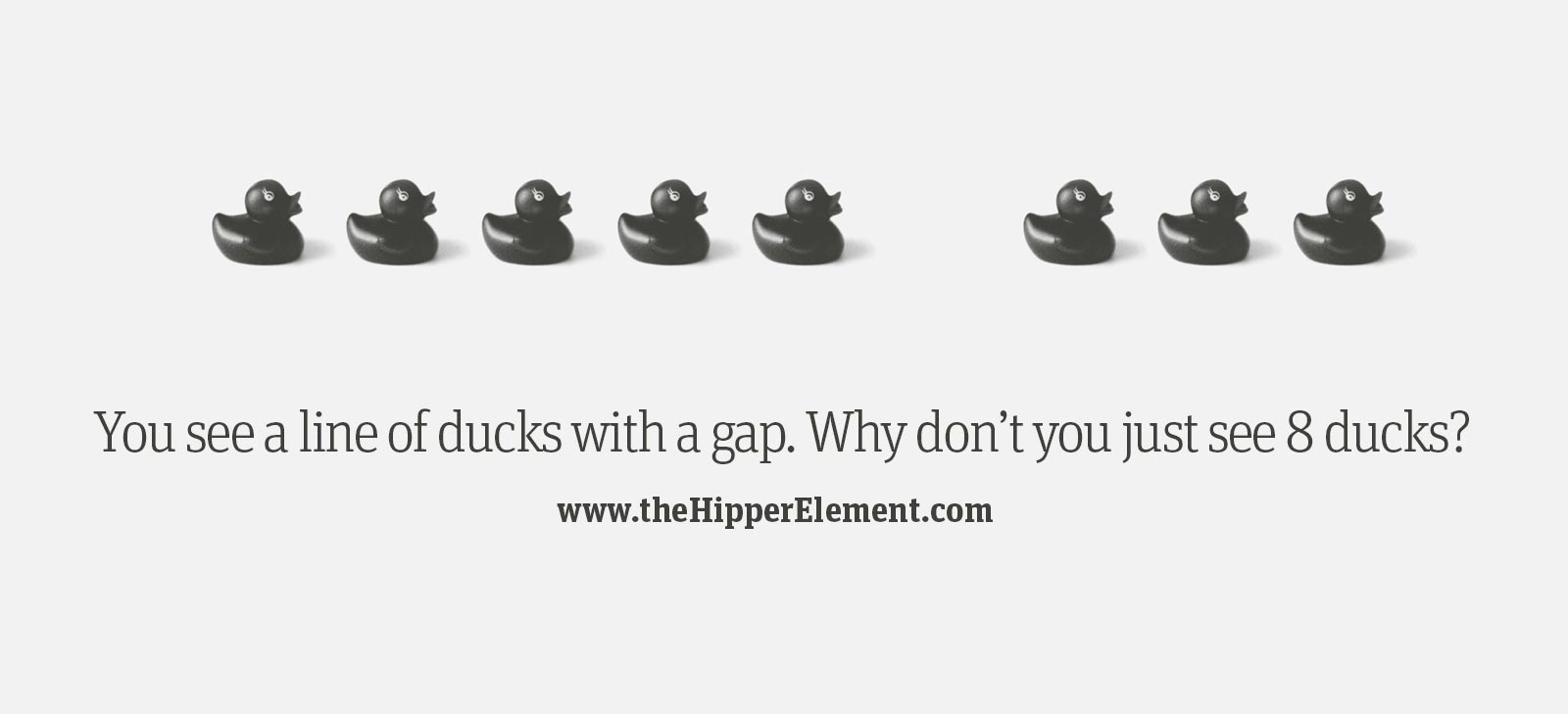
The first image above shows 8 ducks in a row. We don’t see 8 individual ducks; we see a line. That’s line tension. The perception of a line or a “path” when there isn’t one.
Our eyes will follow the path to see where it goes. Super useful.
If we break that path — like any broken pattern — the gap steals more focus.
Edge Tension:
So far we have assumed there is only one line. But what if we create line tension using more than one line?
The result can be “shapes”.
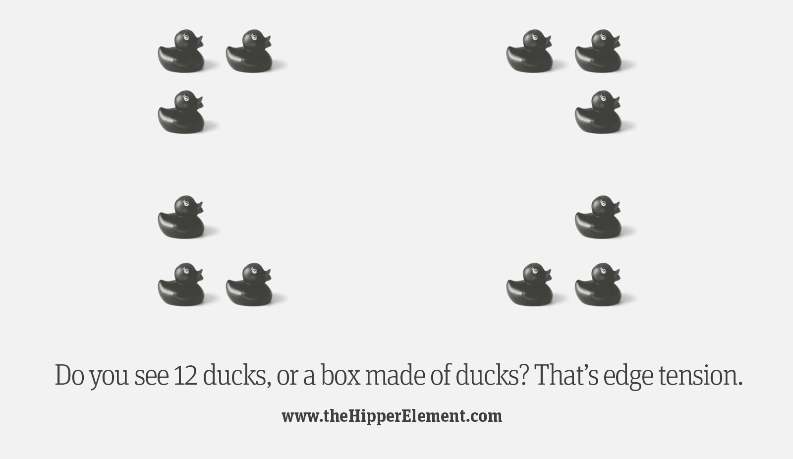
In the second image above, I have arranged the ducks so they appear to form the “corners” of a box. You could see 12 ducks, or four groups of 3 ducks, but your mind really wants to see the box, so it does.
Furthermore, now we can put things “inside” the box (like more ducks?!), or in the “spaces” between the “corners”. Similar to line tension, edge tension brings focus to the gaps.
Layout-wise, this can be an excellent way to put more focus on something small, like a label. Or you can create visual paths leading to the button you want people to click. Vintage ads use this technique often.
And conveniently, it makes a layout feel “simpler” and “more cohesive” because a path or a box is only one mental thing, but 12 separate ducks is too much awesome to handle.
Combine your principles:
In this lesson I have left the “tension” gaps blank, but you don’t have to. You can also use colour to create a path like a gradient on a list of items. Or you can add visual weight to a group of elements by treating them like one shape instead of separate pieces. It’s a great way to direct the user’s eyes without adding any more “things” to a layout!
****
Tomorrow we will learn the fifth and final visual design principle for this course: Alignment & Proximity.