
It is easy to imagine every user excitedly reading every letter you write and every pixel you make. Get over it, because real users don’t do that. They scan. Scanning means they only stop to read when something catches their eye. So today we will learn about scanning patterns:
Z-Pattern, F-Pattern, and Visual Hierarchy
(If you’re just starting the UX Crash Course, Start Here.)
****
Using a website or an app may feel like a different experience every time, but in fact, the way people look at any design is fairly predictable…
The Z-Pattern:
Let’s start with the most boring design I can imagine: an entire newspaper page of solid text. All one story. No headlines. No images. No breaks or pull quotes. Just text, in even columns, from corner-to-corner.
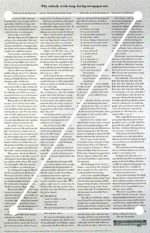
In a design like that — which I hope you never create — users will generally scan it in a pattern something like the “Z” shown above.
Boring! Zzzzzzzz…. (see what I did there?)
The reason I spent the last five days teaching you visual design principles is so you would know how you can make this layout better.
Aha!
If we add a bigger headline (visual weight), create one column to follow (line tension), and use smaller sections (repetition) we can get people closer to the famous F-Pattern.
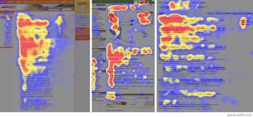
The colourful image above shows eye tracking results, called “heat maps”. Eye tracking records where people look; the longer they look at something, the more “hot” it looks in the heatmap.
Similar layouts = similar results.
The F-pattern made the founders of the Nielsen Norman Group famous a while back. And although they haven’t done any “breakthrough” work in a while, they still publish many reports worth reading.
The F-Pattern works like this:
Start in the upper left corner, like the Z-pattern.
Read/scan the first (head)line of the text.
Scan down the left side of the column until you find something interesting.
Read the interesting thing more carefully.
Continue scanning down.
By repeating that method over and over, the heatmap starts to look like an ‘E’ or an 'F’, hence the name.
****
Why is this important?
You may notice that some parts of the page get lots of attention “naturally” while other parts of the page are overlooked most of the time. This is what we mean by “strong” and “weak” spots in a layout.
A button in the top left will get more clicks than a button in the top right, which will get more clicks than a button in the bottom left, which will get more clicks than a button in the bottom right. And all of those will get more clicks than something randomly stuck in the middle …unless you do something about it.
It might also be good to know that each “block” of content and each column can have their own F-pattern. It doesn’t have to be one-F-pattern-per-page, but that is a more advanced conversation for another day.
****
Visual Hierarchy:
When you consistently use typography to indicate the importance of text, and certain colours to highlight buttons, and when you give more visual weight to things that matter, it creates a visual hierarchy. i.e. — a design that people can scan easily. Our eyes jump from important thing to important thing rather than scanning like a robot.
Some designers think visual hierarchy is good because it looks better, but the truth is that it feels better because it is easier to scan.
****
Wanna see other types of eye tracking results? Check out my Eye Tracking board on Pinterest!
****
Tomorrow we will continue our eye-tracking-inspired thinking by learning how people use designs differently depending on their goals: Browsing vs. Searching vs. Discovery.