
There are many common questions about UX design that you will get throughout your career. And some that you should get, even though you won’t. So today we will learn a few things about:
The Fold, Images & Headlines
(If you’re just starting the UX Crash Course: Start Here.)
****
The Fold:
One of the most popular old-school misconceptions is about “The Fold” which — in case you’ve never heard of it — is the part of your design that is visible before the user scrolls.
Everything above The Fold will get maximum visibility. However, from the studies I have seen, you can expect 60-80% of users to scroll if they expect to find something useful below the fold.
Whatever is above The Fold should inform users about what is below The Fold. If user’s don’t know what is down there, they might not be interested enough to find out.
Careful: It is popular right now to use huge background images at the top of the page. If it looks like the site ends at The Fold, people might leave instead of scrolling. And if you need to add a graphic that says “scroll down” your design is weak.
Learn more about The Fold Here.
****
Images:
Many UX designers treat images as if they are not functional, but images can lead the user’s eyes, so you should think about them.
Images of people, specifically, draw more attention than anything else you can use in your layout.
As a general guideline, the more emotion an image adds, the more engaging it is.
Protip: For images of people, try to get the eyes of the person in the image to look in the direction you want the user to look. It’s shocking how much difference it makes.
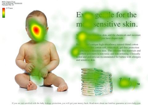
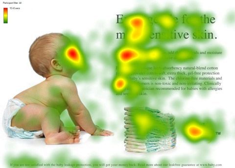
Both heatmaps above show the same layout. One has the baby looking at the headline, the other has the baby looking at the reader.
The result for both images show that users focused on the baby’s face a lot, but only the second image got a lot of attention on the text content, product photo, and logo.
Which image would you choose?
****
Headlines:
Other than pictures of people, our eyes are most attracted to the largest, highest-contrast piece of text in a layout. So when you add a big headline to your design, you have just chosen where people will begin scanning.
Therefore, it is important that your headline is aligned with the most important content below it. If that content is not very important, you will draw too much attention to it (and away from other content.) If it is not aligned, users will look for a new focus point after they read the headline.
****
tl;dr
Give people something to focus on before they scroll.
Make it obvious that they can scroll.
Choose images that add emotion and direct the user’s eyes.
Use headlines to direct users to what matters most.
****
Tomorrow we will learn the rule that finally answers the question of whether buttons should be on the left or right: The Axis of Interaction