
You don’t need a deep knowledge of statistics to see interesting things in a graph. Human behaviour makes some predictable shapes! So today we will learn about:
Designing with Data: Graph Shapes
(If you’re just starting the UX Crash Course: Start Here.)
****
There are two graph styles that human behavior creates fairly often: Traffic and Structured Behaviour.
****
One little note: I have used a “bar graph” in these examples because it was faster to draw. Your analytics may use different types of graphs.
Don’t panic. They all do basically the same thing. That’s why we’re learning shapes, not graph types.
****
Traffic Graphs
These graphs show the number of people that did something, over time. Like the number of visitors per day. We call that “traffic”.
Traffic will always be moving up and down a little, because random things in the world happen every day. Even when your site doesn’t change at all.
That’s why we can never assume that a small change in traffic was caused by a new feature or a design change.
Now, on with the shapes!
****
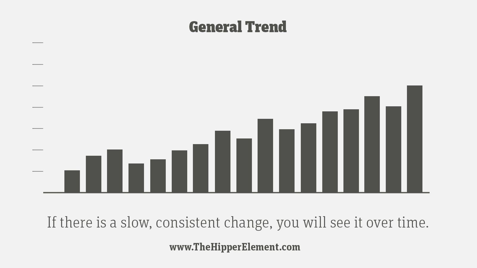
If it would be fairly easy to walk across your graph, and it shows a consistent “rise” or “fall” then the trend is likely to continue, unless you change it.
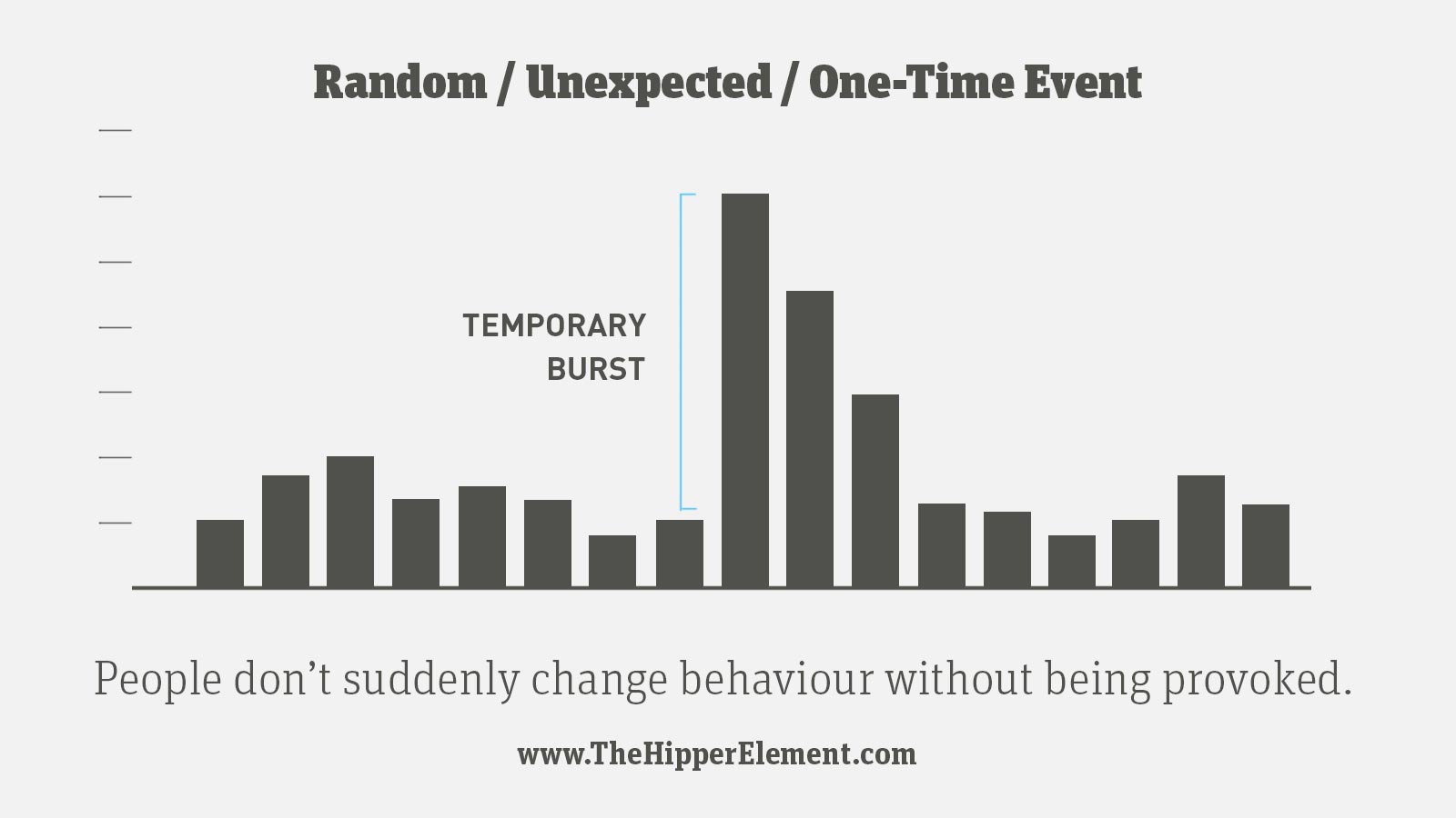
Did you run a weekend campaign? Or is something technical causing problems on one of your pages? Or maybe your sex tape just went public? When you see a “spike” in a graph (or a sudden “drop”), try to find out what is causing it, because — as tempting as it is to believe that you have spontaneously become cool — there is always a reason for a spike. Sometimes good; sometimes bad.

See how there is a pattern repeating over and over?
Sites that are popular with “office workers” often get more traffic during week days. If your users are all kids who go to school during the day, weekends might be your big days. That is very common and very normal.
But…
If it’s a healthy pattern it will usually come with a slow growth trend, too. If you see a super-predictable pattern and your numbers are slowly going down, your users might be dying of boredom. Shake things up!
****
Structured Behaviour Graphs
The other big type of graph shows what people are doing. The date or hour when they did isn’t as relevant. You have a big effect on this type of behaviour via your information architecture.
Note: “structured behaviour” is just a phrase I made up for this lesson. If you say it at work you will sound smart, but nobody will know what you’re talking about.
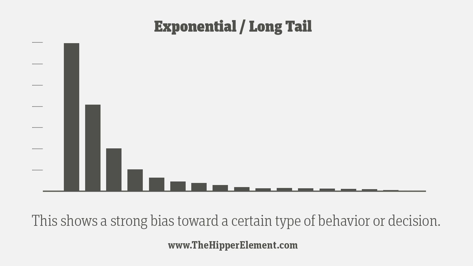
The graph above shows a shape like a slide. More people will click the first thing than the second thing, and more people will click the second thing than the third thing. Any time there is a visual order — like a menu — or a natural sequence the graph will look like this.
The list of “Top pages” will usually look like this, because you can’t get to page two without going through page one. The detailed view of Time-per-Visit or Pages-per-Visit also usually look like this, because spending more than 10 seconds on a site is so damn difficult.
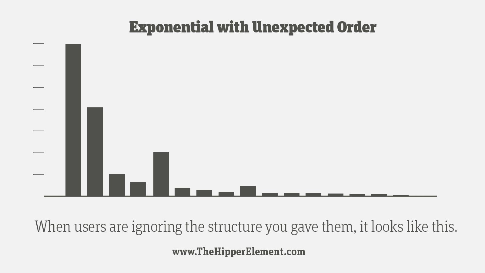
This one is more interesting. If your data looks like it has all the right pieces, but a few are in the wrong order, it means that users have different priorities than you thought. They are clicking the second thing before the first thing sometimes. Those crazy bastards!
Try to change your design/information architecture so it matches what the data is telling you. Don’t try to change the users though. They hate that.
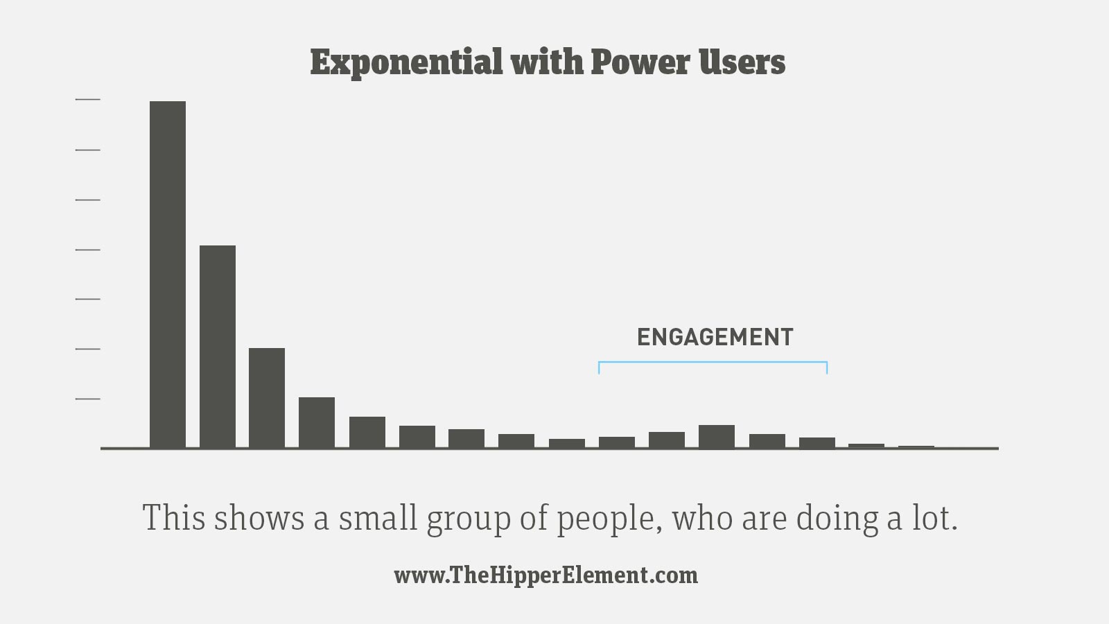
This graph looks pretty similar to the first “slide shape” but it has a bump. Some people think the graph is pregnant, but those people are idiots. This is what it looks like when you have a small group of people that are loyal, or very active, or spend a really long time on the site. They are doing much more than the average user, so it makes a bump.
Find out what motivates them and make more of it!

You want your “slide” to look gentle and smooth. If it has any insane drops or rough spots, those indicate problems. If the home page of your site is really confusing, you might get a graph like this, because very few people will get to the second page.
A/B tests are a really effective way to find the problem, if it isn’t obvious.
****
Speaking of A/B tests, tomorrow — for our final lesson of the crash course — we will learn how to be in two places at once: A/B tests!