
So far we have mostly discussed the ways to understand and plan UX design. Today, we start actually making shit. The first step in designing a real solution is the general structure of the thing. That means you will need an introduction to:
What is Information Architecture?
(If you’re just starting the UX Crash Course: Start Here)
****
If the idea of creating “structure” in “information” is completely new to you, this presentation might help get you started: Understanding Information Architecture.
Information Architecture (IA) can be relatively simple with a small project, and incredibly complicated with a large project.
IA is invisible. To work with it, we need to draw a Site Map. Here is a simple example:

This example shows a website with 6 pages: The home page, 2 sections in the main menu, and 3 subsections. The lines indicate which pages are connected by navigation (menus & buttons).
Note: A million users doesn’t mean you have a million profile pages. You have one profile page which can display any user’s profile.
When pages are organized this way — like a family tree — it is called a “hierarchy” or “tree”. Most sites and apps are organized like this (but it’s not the only way).
****
There are no “rules” for drawing Site Maps but here are some general guidelines:
Just because it looks simple, doesn’t mean it makes sense.
Keep it clear and readable.
We usually draw top-to-bottom, not left-to-right.
Don’t make a Site Map “fancy”. It’s a technical document, not a fashion show.
****
Deep or Flat, not both.
Generally speaking, your site map will either be very “flat” — which includes more Sections in the menu and requires less clicks to reach the bottom — or your site map will be “deep” — simpler menus, but more clicks to get where you’re going.
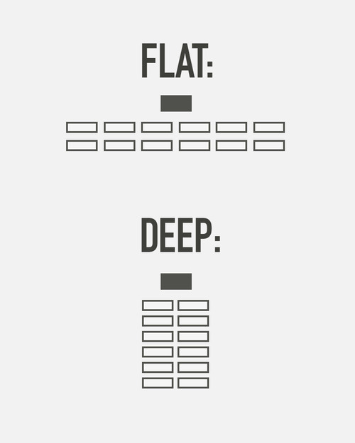
Notice that both of the structures in this example have the same number of pages. Equal, but different.
Sites with a lot of products, like Wal-Mart, often need a deep architecture, otherwise the menus get ridiculous. Sites like YouTube, which only has users and videos to deal with, are usually more “flat”.
If your site is deep and flat, that’s bad. You might want to simplify your goals, or design a good search as a core feature.
****
Common myth: You might hear people say that everything should be “3 clicks away” at all times. That means they learned UX in the 90’s and haven’t learned anything new since then. Focus on the user instead. Make sure they understand where they are, and where they can go, at all times. If your navigation is easy and clear, the number of clicks is irrelevant.
****
Tomorrow we will learn how to choose categories for your menu, (or whether you need categories at all): Types of Information Architecture.