Selected Project:
Stardoll
How to generate millions of dollars in revenue
by thinking like a 12-year-old girl.
Summary:
Results:
· 188% more user sales, globally.
· 400% more top-of-funnel conversion.
· 37% more bottom-of-funnel conversion.
Type of Project:
Social game platform, primarily for girls.
Delivered:
5 A/B tests, which generated more user sales than everything else the company did that year. Other unrelated projects and the Piczo case happened in parallel to this project.
Length of Project:
A few weeks per A/B test, over the span of a year.
Team:
Joel Marsh, one illustrator, the technical payments manager, and 3 developers (with support from the larger in-house team, of course).
Joel’s Roles:
Research, data analysis, UX design, and UI design.
Fun Fact:
Stardoll had 2 billion page views per month, so we sometimes tested things just out of curiosity. We once created a cute animated puppy, just to settle a bet with the Head of Sales about whether people would buy something that had no utility in the game. They did. A lot.
Context:
It was 2009.
At the time, Stardoll had 100 million users. By the time the site lost its mojo many years later, over 400 million people had registered. The average user was a 12-year-old girl. That meant we had to follow COPPA regulations at all times, which strictly limit what you can do and say to kids for marketing purposes (and that's a good thing, which we cared about). It was a fascinating user base to work with. Stardoll had fans, not just users.
The idea behind Stardoll was simple: it’s an online dollhouse. Everything in the whole game was illustrated by hand, from eyebrows to Chanel dresses to futuristic luxury suites.
Every user began by designing a doll (usually to look like yourself), then bought furniture for your dollhouse (or “suite”) and clothes. It started as a one-woman-show, but over the years, Stardoll evolved into a whole marketplace where users created and sold their own clothing designs, real famous brands sold illustrated versions of their real collections, and users interacted with each other through messaging and friendships and community features.
Some of the things people created in that game would truly blow your mind. And the highest-spending user ever was a 49-year-old professional woman.
As a company, Stardoll was organised into small teams, and each team had a focus. Everything in this case was created by a team of 5 people who focused on premium memberships (i.e., paying users). The game was free, so our real focus was the traffic and conversion rate on payment pages, and any way to create value in the game itself (so users would spend their virtual currency, Stardollars, which cost real money to get).
After a basic UX review and way too much time reading fan blogs, we decided to test 5 hypotheses, described below.
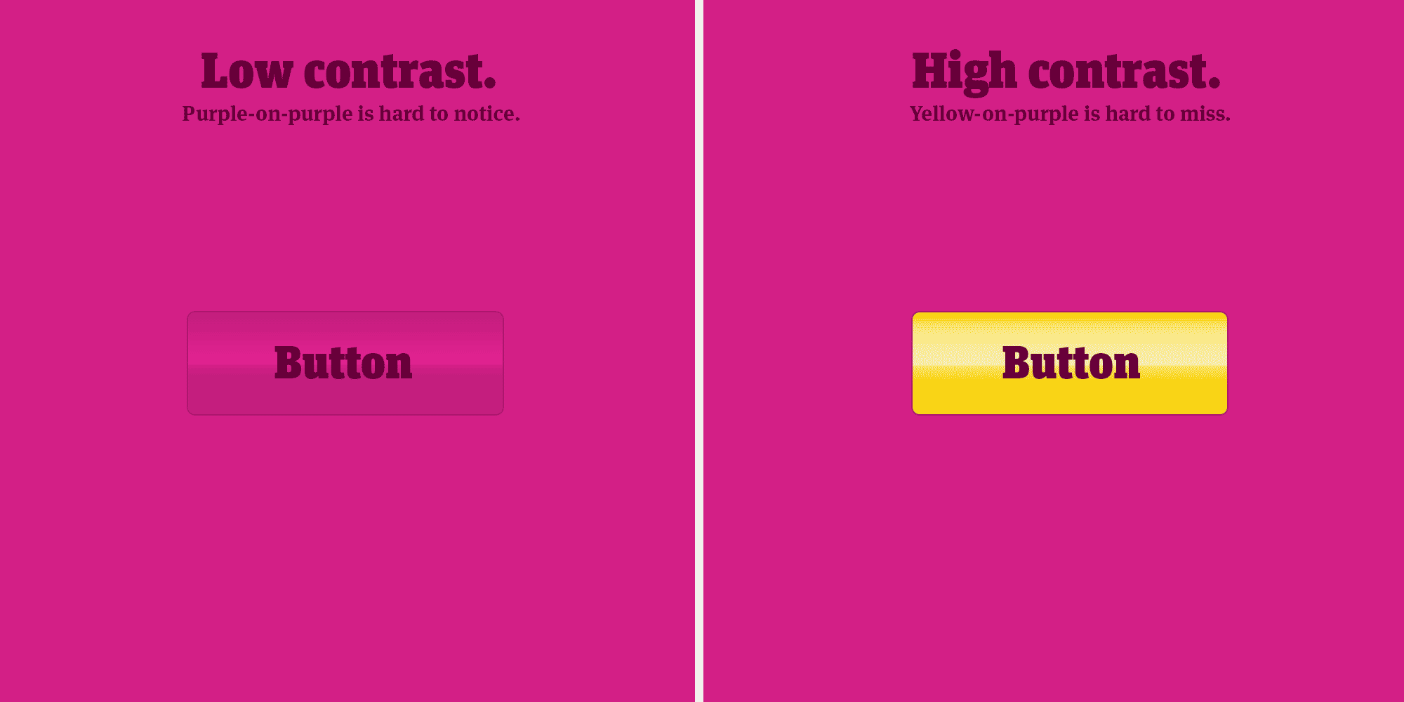
Hypothesis:
The CTA button is hard to see.
The CTA button was overlooked by anyone who had worked at Stardoll more than a few weeks, because the button was huge. A huge button is obviously getting lots of clicks… right? Apparently not.
(CTA = Call To Action. Like “Buy Now” or “Subscribe Here” or “Follow @JoelMarsh”.)The problem was the color and location. It was a dark purple button on a dark purple background, close to the fold on a typical screen. It looked good as a layout, but the button blended into everything else instead of standing out.
If you are 12 years old, and you are busy playing a game, a button that blends in becomes invisible. Actually, that’s true even if you’re 50 and not playing a game. So nobody clicked it, even though it was huge.
The change we made was so simple, it’s a design cliché: we changed the button color to yellow (and moved it up a little higher on the page). In color theory, yellow is considered the complement of purple, and complementary colors sort of “vibrate” beside each other. It also happened to be one of Stardoll’s brand colors. This created a striking contrast on an already big button, and the A/B test results were shocking.

Hypothesis:
The CTA button text is too vague.
The text on the premium CTA button said “Become a Member”, which didn’t offer a clear benefit. A member of what? Aren’t the users already members of Stardoll? And throughout the site, all the text described premium upgrades as “membership”.
We changed the CTA button to say “Upgrade to Superstar” or “Upgrade Now” and the results were amazing. For the first time, many users understood that the free game was not the only way to play, and the traffic increase proved how many people were affected.

Hypothesis:
Users are unaware that they
can upgrade at all.
We saw a lot of users (and bloggers) talking about their Stardollars as if they needed to save up, and that concerned us. Saving your Stardollars means you are not playing the game (or having fun), and it means you’re keeping that currency out of the game, which actually hurts the whole experience.
We put a CTA button in the main menu. Yellow, with a star on it, which said “Upgrade to Superstar”. When you clicked it, you landed on a page that showed how many Stardollars you got with a premium membership. No explanation required.
If you were already a premium member, the button said “More Stardollars”, and was equally—if not more—effective.
That button became the #1 Path-to-Purchase on the site instantly.
Hypothesis:
The buyers and the users are
not the same people.
Funny thing about 12-year-old users: no credit cards.
Funny thing about their parents: not Stardoll users.
We hypothesised that the payment flow should be designed to work for kids up to a point, but after that point it should be designed so parents can easily say yes and complete the purchase themselves.
In other words, when your kid comes to you and says “Can you buy me an upgrade on Stardoll?” We wanted you to be four text fields and a checkbox away from saying yes, instead of three pages worth of reading and a 10 minute discussion about how many Stardollars are needed to buy the limited edition DKNY dress that just came out yesterday. Please, please, please!?!?!
So we did a re-design of the actual requirements for buying: one default amount of Stardollars, minimal credit card details, and a checkbox to automatically renew it every month. No parental decisions, just say yes. ;)
It was a multi-million dollar hypothesis.
Hypothesis:
There are too many ways to pay.
Stardoll was actually amazing when it came to supporting the different payment methods available across the world. So amazing, in fact, that in some countries you could pay with up to 20 different kinds of credit cards, debit cards, gift cards, pre-paid cards, text message payments, and so on.
When real people are forced to choose between 20 things, a lot of people will just give up and choose nothing. It’s called the Paradox of Choice. More options = less decisions. So we decided to test how many people would pay if we only gave them the two most popular options, and gave users a button to show the other options if needed.
Any serious economist will tell you that more payment options will lead to more payments, because it enables more people to pay. And in this case, any serious economist would be wrong.
It was another multi-million dollar hypothesis.
That one change was responsible for 17% of all global user sales that year.
Read Another Case