One important Visual Design Principle involves the creation of patterns to lead the user’s eyes to important things. And like all good rules, patterns are made to be broken. So today we will learn the visual principle of:
Repetition and Pattern-Breaking
(If you’re just starting the UX Crash Course, Start Here.)


The Old-Timey Rubber Ducks make their triumphant return!
Human brains have a particular talent for patterns and sequences. Whenever something in nature happens over and over, we will quickly notice. In fact, we don’t just notice, we think about those things differently.
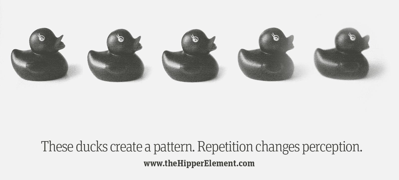
The first image above shows five identical rubber ducks in a row. We don’t see five individual ducks though, we see a row of ducks. We treat them as a group or a sequence, and if you live in the Western world, you will probably look at them left-to-right because that’s how we read.
If that row of ducks were a menu or a list, we would do the same thing. Therefore, you could expect more people to click the options on the left, and less people to click the options on the right.
Breaking a Pattern:
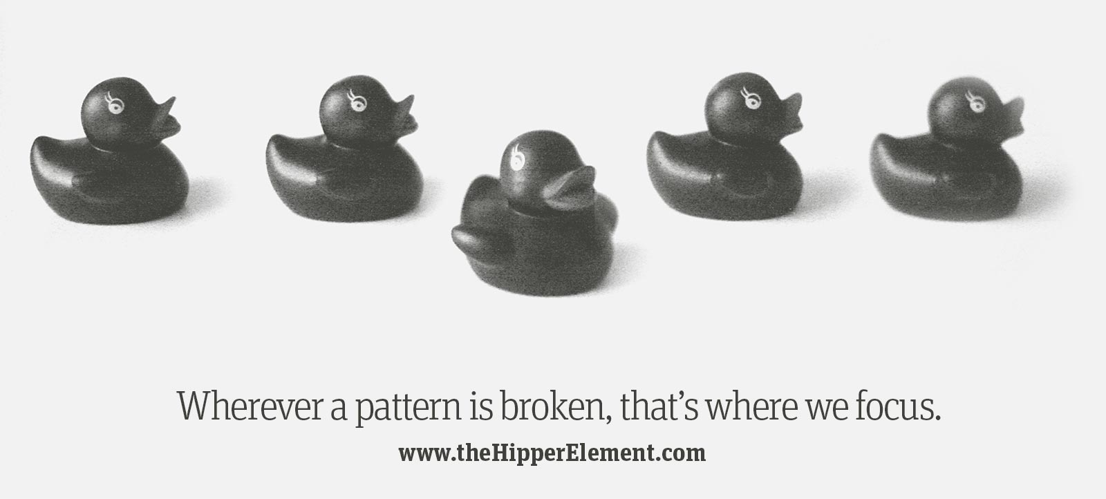
The second images shows the same 5 rubber ducks (handsome, aren’t they?) but this time one of them has gone solo . We’ll call her Beyoncé.
That changes everything.
Now we see a row of four (jealous) ducks, and Beyoncé is alone, in the spotlight, lookin’ hot. It is hard not to focus on Beyoncé, even though all 5 ducks are equally majestic creatures.
Now, if that were a menu, the middle option would get far more clicks than before, because our eyes fixate on it. Also, those clicks would be stolen from the left options, so the left options would be less popular than before (although probably still more popular than the far right option).
That’s a powerful thing to know.
This may seem simple and obvious, but when you apply that principle to your designs — or your dance routines — it can make people notice the important buttons, options, or pop stars.
Be careful: pattern-breaking can also lead the user’s eyes away from other important things. Before you can break a pattern, you have to make one.
Combine your principles:
To make a pattern or a sequence, keep visual weight and colour consistent. The users eye will start at one end and follow the pattern to the other end.
To break the pattern, just switch it up in the place where you want to add focus. Make the “Register Now” button an unexpected colour, size, shape, or style, and watch your clicks go up overnight!
****
Tomorrow we will learn a more advanced version of this idea: Line Tension and Edge Tension!
