The last motivation we will look at individually is the one behind teaser trailers for new movies and your anger when Facebook suddenly changes their features without warning. Today, we will learn about:
Motivation 3: Understanding (Curiosity)
(Just starting the User Psych Crash Course? Start here.)
****
Understanding or “curiosity” is the motivation to get information about a situation that involves the other 13 motivations. We are also motivated to protect what we already understand.
The funny thing about understanding is that — even though it’s pretty simple — designers and marketers screw it up all the time.
****
There are two rules for creating curiosity:
1) The user must understand enough to know there will be a gain or loss in one of the other 13 motivations.
2) The bigger the gain or loss seems to be, the more interesting it becomes.

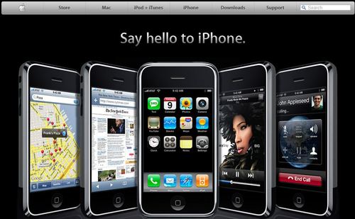
This is the original website for the first iPhone. You see just enough to know that it’s a gain in status over the phone in your pocket, but the specifics are hidden.
Voilá! You’re curious.
****
How to Screw it Up
The best way to suck at making people curious is to offer them something that isn’t one of the other 13 motivations. Ironically, the most common example of this is a chance to win an iPhone or iPad.
First: everyone already understands an iPhone or an iPad. No curiosity.
Second: it’s only a chance to win something that a lot of people have. (Remember that Status is relative to other people). So the gain in Status is actually pretty small. No curiosity.
Instead, think of a way to make your product seem like a motivational gain, or not having your product seem like a loss. Forget the “stuff”.
****
As a UX Designer:
Users will choose something they understand over something they don’t. It doesn’t matter which one is actually better.
When you change or add features, avoid using curiosity as a marketing strategy. Tell users what is coming, tell them why, show how it works, and give them time to adjust (if you can).
Otherwise users will be angry or afraid, because you're taking away something they already understand. And that’s a loss.
****
You have already learned a lot of user psychology! But so far we have mostly learned principles.
Tomorrow we will start learning how to apply those principles to get the results you’re looking for: Designing with Intention.
