Your brain is a system. Certain types of information go in, certain types of information come out. But like many systems, if you give it information it wasn’t designed for, you can get less-than-perfect results. Today we will learn:
What is a Cognitive Bias?

(Just starting the User Psych Crash Course? Start here.)
****
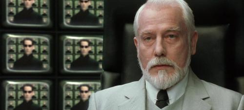
Have you ever seen The Matrix? When Neo (Keanu Reeves) meets The Architect, it is revealed that there have been other Neo’s before. They are a “systemic anomaly” that happens from time to time.
Cognitive Biases are sort of like that.
If you ask people certain types of questions, the system of their intuition will reliably choose the wrong answer.
Those “mistakes” are something we can use in UX design. We can let users choose whatever they want, and most of the time they will choose what we want. If you do it right.
Some examples will help…
****
Anchoring: The first number you say effects the next number in someone’s head. For example, if you ask people to donate to a charity, they might give an average of $2. But if you “suggest” a donation of $10, the average will go up to something more like $5. Nothing changed, but you anchored them to $10, which made $2 feellow.
Next time you want a raise at work, aim high. You won’t get the full amount, but the raise you do get will be higher.
****
Bandwagon Effect: The more people that believe something, the more likely it is that other people will believe it too. Information doesn’t get more true or more false because lots of people believe it, but your brain doesn’t know that. Your mom always said, “if everybody jumped off a bridge, would you do it too?”
Because all the other moms say that too.
This is why you should usually show how many people have Liked, registered for, or shared something. It’s also why informercials say shit like “a million people can’t be wrong!” Oh yes they can!
****
Decoy Effect: One of my favourites. Imagine you want to subscribe to a newspaper’s site, and these are the choices:
Web Only: $10
Print Only: $25
Print & Web: $25
Which one is the best deal? After a few seconds to consider it, there is about an 80% chance that you think Print & Web is the best value. Why? Because the Print Only price is the “decoy” — nobody will choose it. It’s only purpose is to make the most expensive price look like a good deal. Even though nobody chooses it, if you remove it, about 60% of people will choose the cheapest option instead.
It’s not rational. It's biased.
If you are American, you have an election coming up soon. Think carefully.
****
There are many types of Cognitive Biases. Too many for this course. Over the next few lessons you will get a taste of them.
Tomorrow we will learn more about designing sets of options: The Illusion of Choice.
