
When most people think of UX, they think of the lines-and-boxes diagrams we call wireframes. Unfortunately, many people think that doing wireframes is the same as doing UX. So today we will learn:
What is a Wireframe?
(If you’re just joining the UX Crash Course, Start Here.)
****
If you have been following the Crash Course up to this point, you know that UX is an iceberg: the part you see is only a small fraction of the problem.
Before we get started, you should read What Isn’t a Wireframe, just in case you have let some bad habits into your own process (or your company’s process).
****
The General Idea:
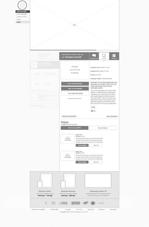
A wireframe is a technical document, like the one above (but not necessarily as “pretty” as that one). Lines, boxes, labels. Maybe a color or two. That’s it.
Wireframes are often compared to blueprints because they have a similar purpose.
A blueprint tells builders how to execute the architect’s plan. Not which wallpaper or furniture to choose. And blueprints are taken seriously. They aren’t a suggestion, or a “rough sketch” or a “quick mock up”.
All those sketches you make on whiteboards or during brainstorming sessions are valuable, but they aren’t wireframes. They are your thoughts about the wireframes you will make later.
A wireframe may only take an hour to draw, but it can take weeks or months to plan. It is important that your colleagues and clients understand that.
If a UI developer or UI designer can’t use your “wireframe” yet, it isn’t a wireframe. It’s a sketch. Keep going.
****
That may not seem like a whole lesson, but I am going to stop there.
The next 12 lessons — almost half of this course — will improve your wireframes by making your designs work well, not just look good.
****
Tomorrow we will learn the first of five lessons on how to make people look where you want them to look: Visual Weight.