
This lesson is the first of 5 visual principles that will help you direct the user’s attention. Some parts of your design are more important than others, but those are not always the things we notice naturally. So we have to help users notice the important stuff. Today we will learn about:
Visual Weight: Contrast, Depth, and Size
(If you’re just starting the UX Crash Course, Start Here.)
The idea of visual weight is fairly intuitive. Some things look “heavier” than others in a layout. They draw your attention more easily. And that idea is valuable as a UX designer.
Our job is to help users notice the things that matter. And it is equally important not to distract the users from their goals.
By adding visual “weight” to certain parts of your design, you increase the chance that a user will see them and you change where their eyes will go next.
Remember: visual weight is relative. All visual principles are about comparing a design element to whatever is around it.
So, without further ado, I would like to introduce you to the stars of the UX Crash Course: The Old-Timey Rubber Ducks! *applause here*
****
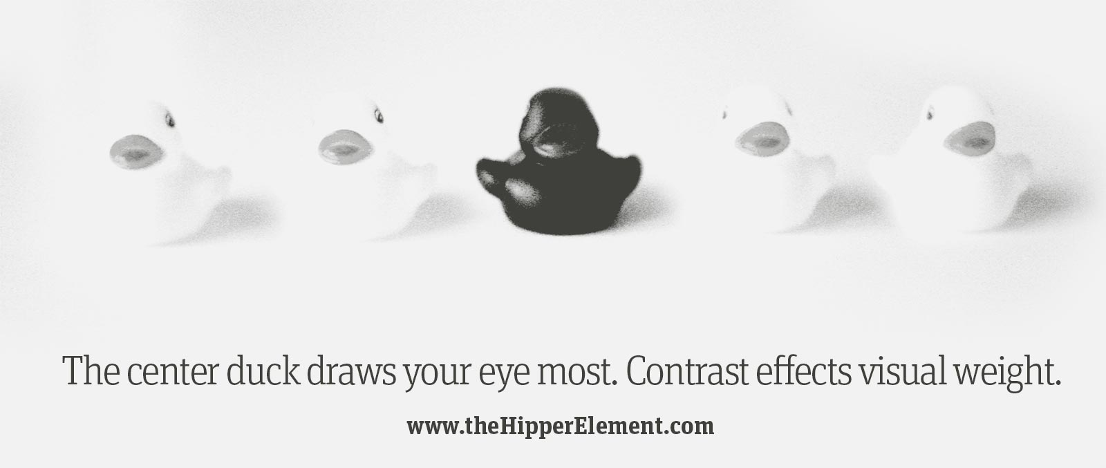
Contrast:
The difference between light things and dark things is called contrast. The more different a light thing is compared to a dark thing, the “higher” the contrast.
In UX, you want to give important things higher contrast, like the duck in the center. In this case most of the image is light, so a dark duck is more noticeable. If the image was mostly dark, the lighter duck would be more noticeable.
If these were buttons, more people would click the dark one than if all the buttons were the same colour.
****
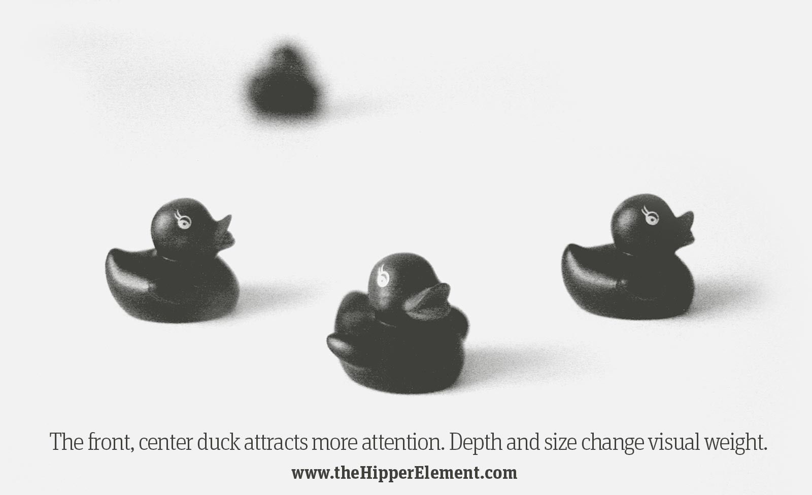
Depth & Size:
In the real world, we notice things that are close to us more than things that are far away.
In the digital world, bigger things are perceived to be closer, like the middle duck above, and something that is smaller is perceived to be farther away (like the blurry duck in the back.)
If these ducks were all the same size, you would probably look at them left-to-right (assuming you read that way).
If you use blur effects or shadows it just makes the perception of depth more realistic. Size has this effect even if your design looks “flat”.
As a general rule, you want more important things to be bigger than less important things. This creates a visual “hierarchy” on the page and makes it easier to scan, but it also allows you to choose what the user notices first.
That’s why it’s wrong to “make the logo bigger”. Unless you want users to stare at your logo instead of buying something.
***
Tomorrow we will learn the second of our five visual principles: Colour!