
Real life is full of sun light, artificial light, heat, cold, clothing, brands, fashion, and a million other things that effect the way we perceive colours. As a UX designer we may not care about Pantones and brand guidelines, but we definitely have to learn about:
Colour.
(If you’re just starting the UX Crash Course, Start Here.)

There are a few things we can learn about colour from the 60’s-inspired Rubber Duckies above.
As UX designers, we usually rock the wireframes in black-and-white. And that’s a good thing! We focus on the function, while the UI designers can focus on the style.
However, sometimes colour is function. Like traffic lights or making the colour of a popsicle match the flavour. You know, important shit.
Meaning:
In the top picture above we see three ducks: blue, yellow, and red. They’re so handsome. Immediately these ducks seem to have different tonality, and it is easy to imagine how the colours can change what each duck “means”.
If the ducks were buttons, they might be: confirm, cancel, and delete. If they were indicators on a fuel tank: full, half, and empty. Or if they were on a stove: cold, warm, and hot.
You get the idea: the ducks are identical, but colours change the meaning.
If you don’t need to indicate something like that, let the UI designer choose colours. But if you do, let your wireframes do the talking.
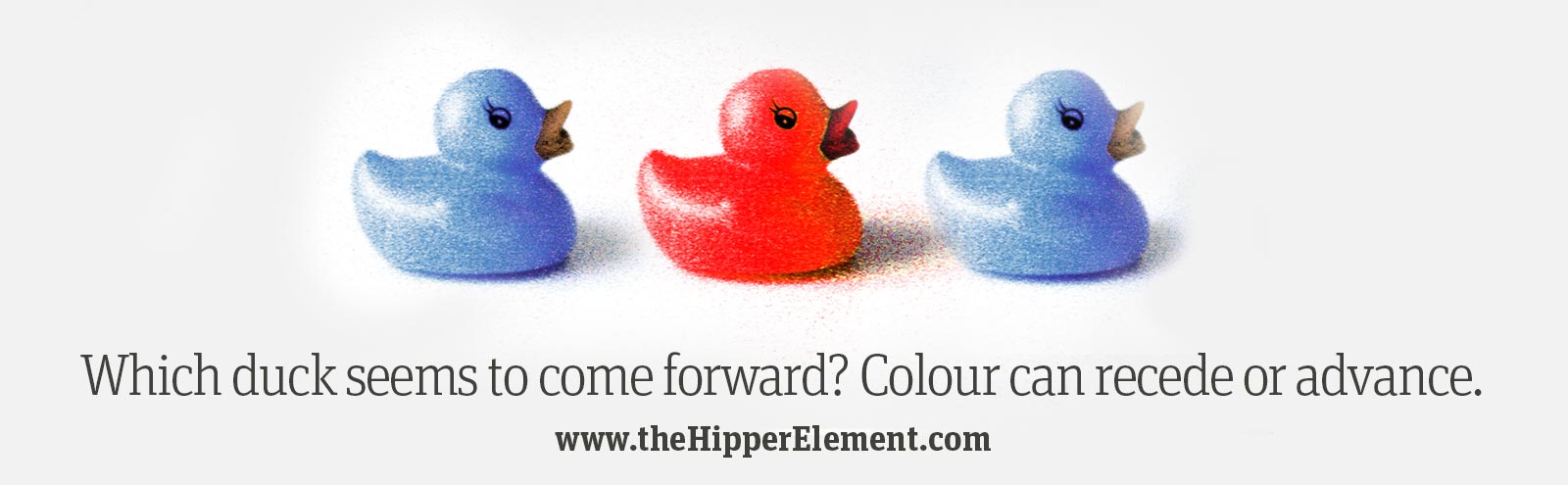
Recede or Advance:
The other thing to keep in mind is that colours can be “loud” or “quiet”.
The second image above shows a red duck and two blueish ones. The red duck almost looks a little closer, doesn’t it? It’s not. Something like a “buy” button should have a colour that makes it jump off the screen. More people will click a colour that “advances” (comes forward).
On the other hand, sometimes we want things to step back so they are visible, but not too distracting, like the two blueish ducks. They “recede” (sink back). This is good for something like a menu that is always on the screen. If it is always yelling at you, that’s unnecessary and it steals focus from more important things.
Keep wireframes simple:
Colourful wireframes just get in the way of the functional details. Use colours where they matter, but don’t make your wireframes blue like blueprints, or dress them up for clients. It makes all discussions about colour confusing: “No, the website won’t be blue…”
Combine Visual Principles!
Colour can work really well with the lesson about Visual Weight from yesterday. Something big is noticable, but something big and red can’t be missed! Make your errors and warning labels red and high-contrast. Or, if you’re just confirming what the user did, something a little smaller in a receding green might be perfect.
****
Tomorrow we will learn the third visual design principle: Repetition & Pattern Breaking!