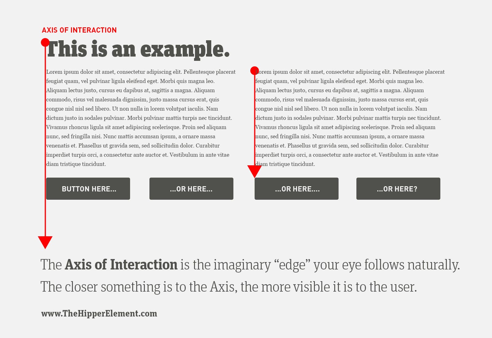
One of the most common questions in UX design is: “Should the button be on the left or the right?” Well, it depends, actually. It depends on where you have created visual “edges”. So today we will learn about:
The Axis of Interaction
(If you’re just starting the UX Crash Course: Start Here.)

This idea is deceptively simple.
Human attention is very limited. We can only focus on one thing at a time, like a squirrel or boobs or Duck Dynasty. So while we’re focusing on one chunk of content, the other chunks of content effectively become invisible.
Don’t believe me? Watch this.
****
Find the Edges:
In every design, you will use the visual principles you learned in this course. When you step back and look at your layout, you will notice that you have created “lines” or “edges” or “blocks” everywhere.
They might be the aligned edge of the text, or your images, or groups of things in a row.
Each of those edges is an Axis of Interaction. Your eyes will follow an Axis until it is interrupted, or until it ends.
Your user’s attention is almost always focused on an Axis of Interaction, and when it stops focusing there, it will hop to the next Axis of Interaction.
****
Therefore:
If you want people to click something, put it on (or near) an Axis of Interaction. If you don’t want them to click it, put it somewhere else.
The farther an element is from the Axis, the less people will see it, and if you don’t see something, you can’t click it.
That’s it!
****
Tomorrow we will get down and dirty with the most difficult part of usability: forms.
